Showing posts with label COLOUR. Show all posts

13 February 2014

PLANTS AND PLANTING SYMBOLS GRAPHICS SHEET

These are the plants I chose for the border I designed for the plants and planting graphics sheet. I was particularly interested in creating late summer - autumn interest as well as providing winter structure.


Acer griseum

Fagus sylvatica (hedge)

Buxus sempervirens (cubes)


Salvia nemerosa 'Caradonna'
 
Anthriscus sylvestris 'Ravenswing'

 Digitalis purpurea 'Alba'

Geranium renardii

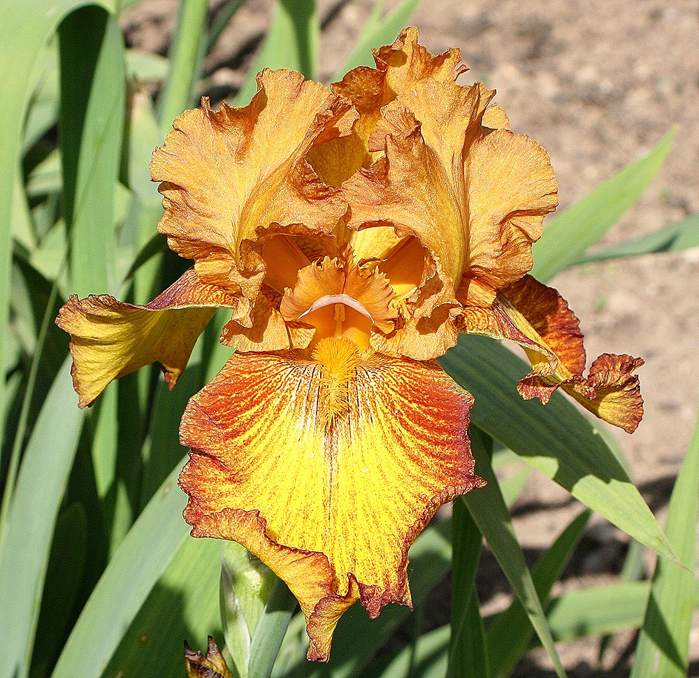
Iris 'Lightning Streak'

Pachysandra terminalis

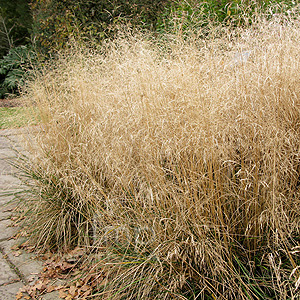
Deschampsia cepitosa

Stipa gigantea
 

12 February 2014

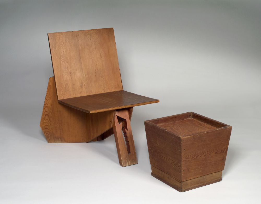
FRANK LLOYD WRIGHT II

FRANK LLOYD WRIGHT (b.1867 - d.1959)
Architect / Interior Designer / Designer
USA 

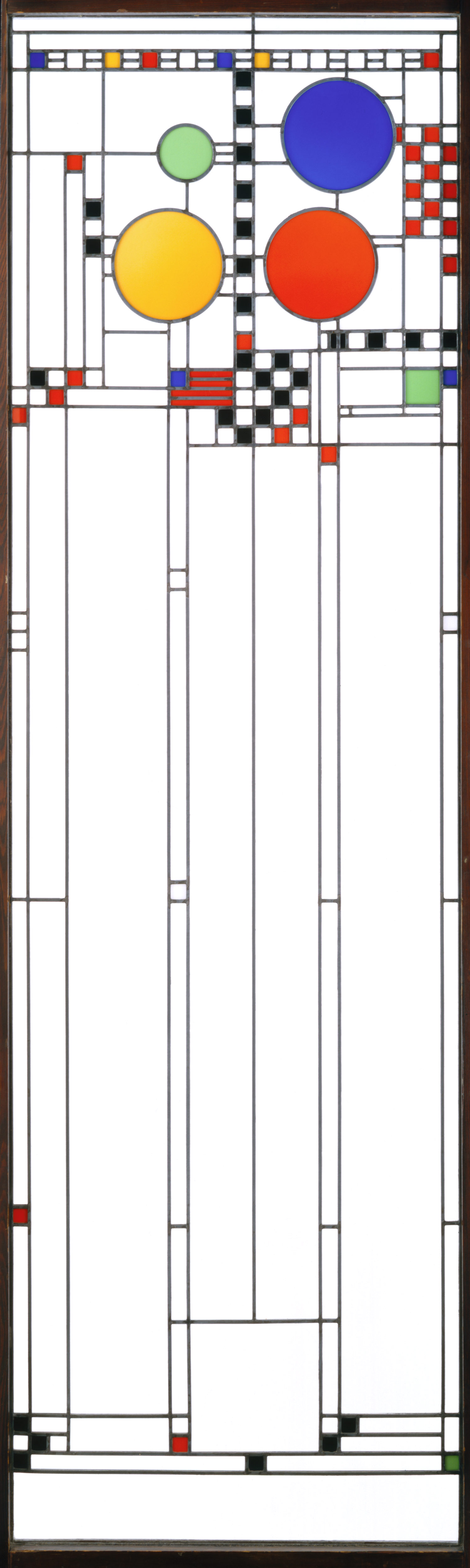
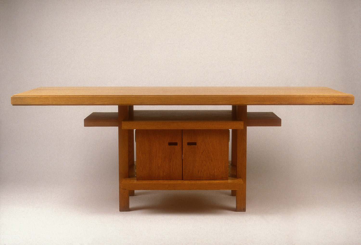
F-L-W also used to design the interiors for his homes and produced some really beautiful stained glass work and furniture. 
When thinking about the minimalist garden, the shapes in the stained glass really stand out. They almost look like garden plans, where the shapes could be planting. When looking at them like that, you can start to see where the ratio of mass and void is so important. I think the furniture would look good in all three gardens. I will look further in to the furniture at a later date.


2 February 2014

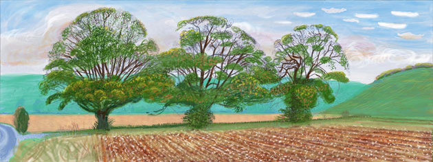
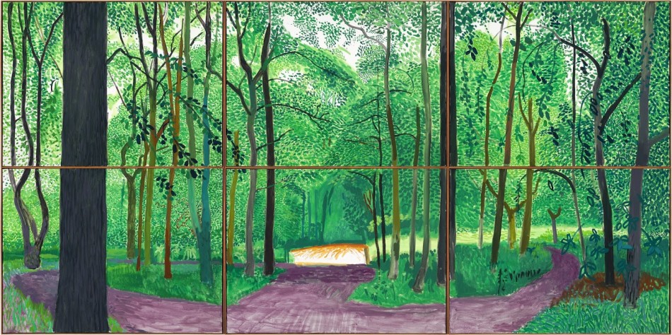
HOCKNEY - A BIGGER PICTURE

David Hockney 
'A Bigger Picture' Exhibition
21 January - 9 April 2012, RA 

One of the best exhibitions i've ever been to.. . . .  .


25 January 2014

D+G

DOLCE + GABBANA
AUTUMN '13 
MENSWEAR COLLECTION

This menswear collection by Dolce & Gabbana is not only beautiful but also a really great example of how limiting the boundaries of your creativity can actually lead to more interesting things. What I mean by that is that the title of this collection was 'devotion' - a word with limitless possibilities. This should in theory give you great scope - however a brief that is too broad can often lead to a lack of focus and a piece of work that fails to capture anything coherent or really meaningful. 
Using D+G as an example, we see them take the word 'devotion' and narrow it right down to study religion in small Sicilian communities. This immediately gave them all the material they needed for colours, shapes, textures and prints. They even cast their models straight from the streets of these communities. 
In design, it can be common to get a brief from a client that is too broad but that supposedly offers you many different avenues to explore. You need to take that brief and narrow it down - set your own boundaries, use your own experiences and you will find that the  outcome is far more interesting (and rewarding) as a result..


23 January 2014

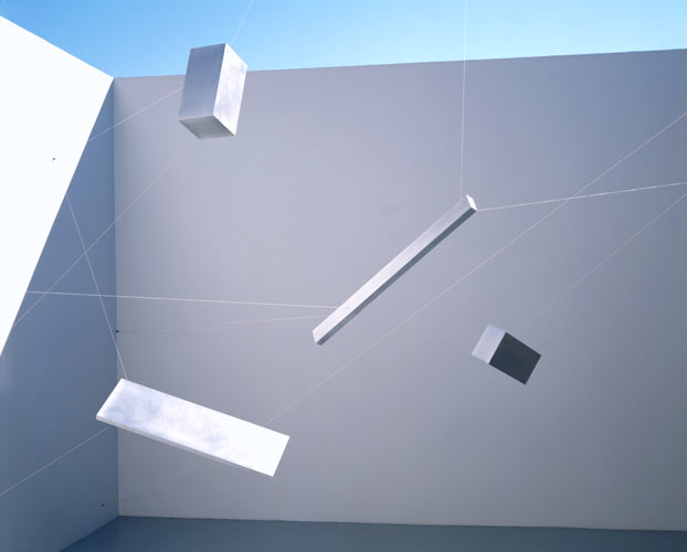
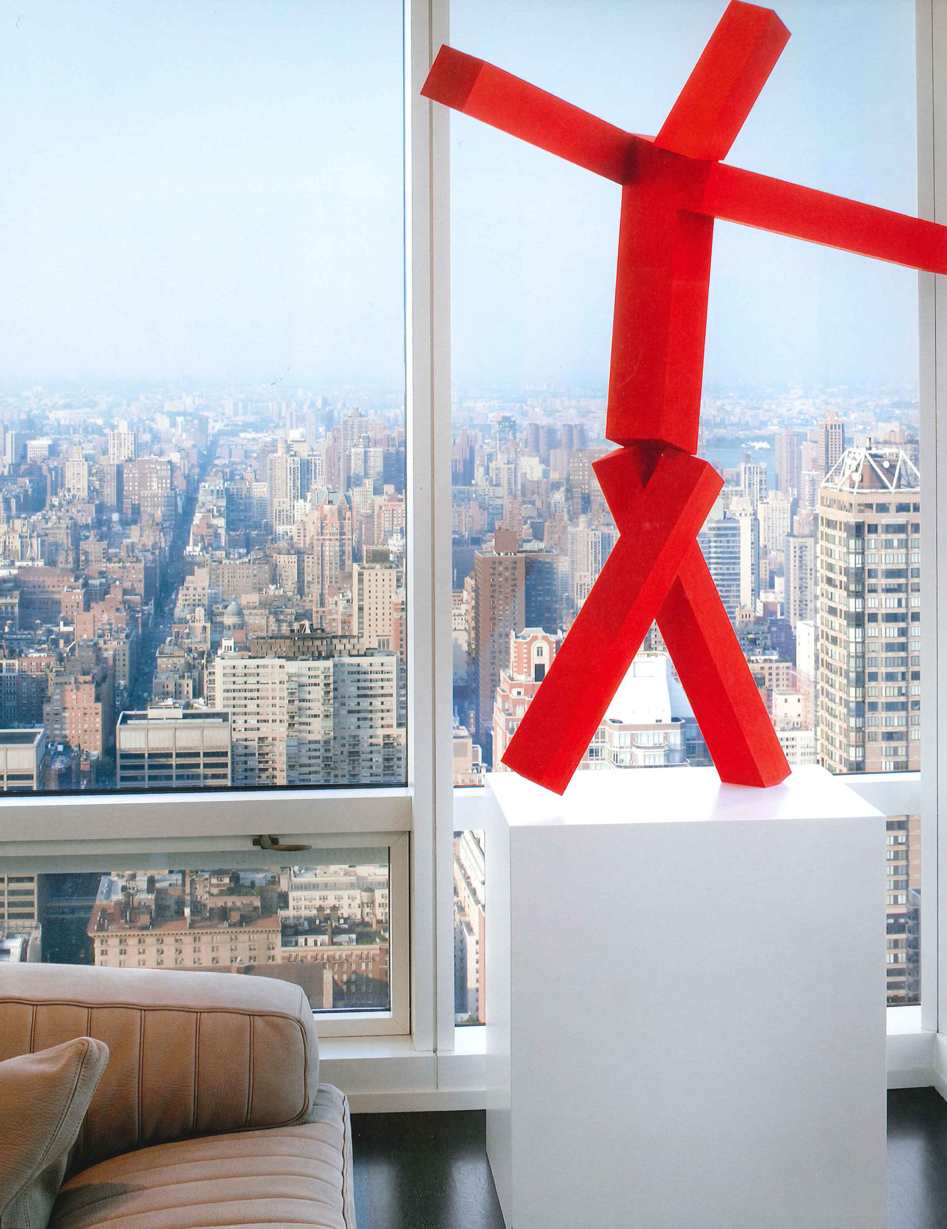
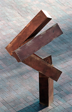
JOEL SHAPIRO

JOEL SHAPIRO (b. 1941)
Artist / Sculptor

A relatively new find for me,  I think these sculptures/installations by Joel Shapiro are amazing. He manages to create a real sense of movement in his work, whether it is displayed in a gallery or a site-specific work outside. Exciting stuff.


19 January 2014

COLOUR PALETTES

MOVIES IN COLOR
Blog
http://moviesincolor.com/about

This blog breaks down film stills in to their colour palettes. It's a really good way of getting you to look at things purely based on the colours rather than being distracted by the actual objects or action occurring in the frame. 
This is really useful skill to practice for garden design, as it enables you to focus on just colour within a design. However, the same discipline could of course also be applied to looking at, for example, leaf shape / plant form / texture / shade + light etc
(see sketchbook)

Moonrise Kingdom, 2012
Director: Wes Anderson
Cinematography: Robert D. Yeoman


Trainspotting, 1996
Director: Danny Boyle
Cinematography: Brian Tufano


Rear Window, 1954
Director: Alfred Hitchcock
Cinematography: Robert Burks


Pulp Fiction, 1994
Director: Quentin Tarantino
Cinematography: Andrej Sekula


Groundhog Day, 1993
Director: Harold Ramis
Cinematography: John Bailey

29 December 2013

TUMBLR INSPIRATION

MY TUMBLR

The place where I record a lot of my visual inspiration of colours/textures/shapes/patterns. I like the fact that one image doesn't need to relate to what is in front or behind it, but that sometimes by coincidence you end up creating an interesting combination by chance.